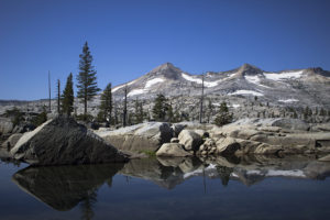
Shutter Speed: 1/2000th of a second.
ISO: 100.
Aperture: f/4.0.
Photo taken at approximately 10:00, lends facing West at roughly 275 degrees towards Pyramid Peak, Desolation Wilderness, California. Foreground lake is Lake Aloha, with Pyramid Peak as the centerpiece of the photo. Unnamed mountains are seen to the north of the peak. The photo was altered slightly using both Camera Raw and Photoshop. Exposure was positively adjusted and vibrance/saturation of the blues was increased slightly. Haze was reduced and clarity was increased; highlights and shadows are more profound. Slight darkening of the corners and edges bring out the luminance in the sky around the peak. This image represents “just right” (1/8).
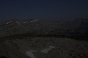
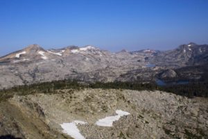
Shutter Speed: 1/1600th of a second.
ISO: 100.
Aperture: f/13.0.
A side-by-side comparison of a considerably dark photograph (left) and a its photoshop-adjusted counterpart. The original photo, shot with the light source directly behind (facing NW, sun SE), had a quick shutter speed, higher aperture, and lowest possible ISO, allowing little light to get through to the camera. The result is a darkened, noticeably faded image of the Tahoe Landscape. The adjusted image was substantially increased in exposure, highlights, and saturation. Since little light information was captured by the camera, the resulting image is noisy (though noise reduction was performed in Photoshop) with little raw detail. This image represents “too dark” (2/8).

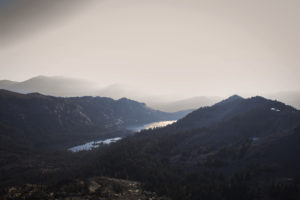
Shutter Speed: 1/125th of a second.
ISO: 100.
Aperture: f/5.6.
A side-by-side comparison of an overwhelmingly bright photograph (left) and its photoshop-adjusted counterpart. The original photo, shot facing directly at the light source (facing SE, sun SE) had a relatively slow shutter speed. The camera, pointing directly at a bright light source, was inundated by light (particularly in the background). A camera being literally blinded by light is quite different than an image being dark. When the photo is dark, the color, information, etc. is still slightly present. In the former, the bright light overwhelms raw color data and landscape features, making it virtually unsalvageable in Photoshop. On the top left corner of the Photoshop-adjusted image, you’ll notice there’s a grayscale gradient. Since light is white- a shade without color-, it operates on a shade (grayscale) spectrum, rather than a color spectrum. I managed to turn it into a shot with a misty, vintage feel; even then, the composition appears terrible as the light takes over roughly 3/4 of the image. This image represents “too dark” (3/8).
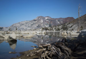
Shutter Speed: 1/2000th of a second.
ISO: 100.
Aperture: f/4.0.
A shot of Lake Aloha from a different location and angle. The stunning Lake Aloha is a washbowl for the surrounding Alpine peaks. The hilly, topographic landscape of the Desolation Wilderness sprinkle hundreds of tiny islands throughout the lake, rendering it a photographer’s dream. Many fallen trees and pristine rocks dot the shore around Lake Aloha’s remarkably reflective waters, offering an impassable opportunity to capture many aspects of the wilderness. The fallen, mangled tree in the foreground stretches to the rising Jacks Peak and Dicks Peak in the distance, with Lake Aloha bridging the gap between the two. Though the aperture is lower than is to be expected for a deep depth of field, the manual focus brings both the peak and the tree into sharp view. Moderate darkening of the edges/corners help bring out the highlights of the photo, centering the group of peaks, while cyan saturation offers a more fitting reflection in the waters. This image represents “deep depth of field” (4/8).
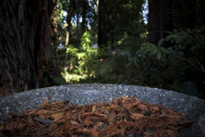
Shutter Speed: 1/80th of a second.
ISO: 100.
Aperture: f/3.5.
A shot of a deserted stone birdbath with overgrown vegetation and redwood trunks in the background. The fallen pine needles offer a jubilant shade of red to contrast with the greens in the background, while the gray serves as a circular border between the foreground and the background. The low aperture- f/3.5- employs a shallow depth of field. The birdbath, while in complete focus (the full resolution demonstrates this better) sees its background in an ambiguous, blurred state. The somewhat slow exposure (1/80) and well-placed light source brightens the photo. This image represents “shallow depth of field” (5/8).
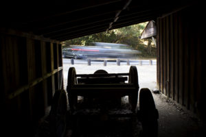
Shutter Speed: 1/5th of a second.
ISO: 200.
Aperture: f/13.0.
An abandoned wagon sits in an 1850’s post office- now a historic museum for the little town of Woodside- as it watches the innovative automobile race down the road. The foreground has been darkened and the background lightened as to symbolize the passage of time. The wagon, now obsolete, sits in the darkness as the automobile steals the spotlight. The wagon, motionless and melancholy, stays still for the frame while the automobile races through the road. The slow shutter speed of 1/5s blurs the motion considerably. The car travels roughly 10.2ft over the course of 1/5th second, equivalent to 35 mph. This image represents “blurred by motion” (6/8).
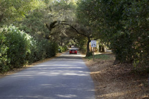
Shutter Speed: 1/90th of a second.
ISO: 200.
Aperture: f/8.0.
A car barrels down the forested Tripp Road, disregarding the speed limit of 25. Though the car was moving quickly, its motion was arrested by a relatively quick shutter speed (1/90th of a second). The car, which I believe was a Ferrari of some sort, represents state-of-the-art innovation. As it plows past the twisted trees and fallen leaves, traveling only on the unsaturated, gray path, it encapsulates the urbanization of society. Probably. This image represents “arresting rapid motion” (7/8).

Shutter Speed: 1/400th of a second.
ISO: 100.
Aperture: f/4.0.
This section culminates with what I believe is among my most successful photos. The light is adequate while not overwhelming, the colors are vibrant yet not an eyesore, and the shadows are dark though the landscape beneath is discernible. This is Dicks Lake in backcountry Tahoe, with Dicks Pass, Dicks Peak, and Jacks Peak creating the backdrop. The snowmelt-fed Dicks Lake is one of the clearest I have ever seen. In the full resolution, aquamarine rocks are unmistakably visible even beneath the saturated blue and green reflection in the lake. The magenta sky was added in photoshop in order to change the white color captured by the camera (due to some light source interference) to a more appealing, calm color. The composition, aided by the reflection, is decent (note that all shadows and land combine in the very center of the photo) and the lone protruding rock adds detail to the water. This image represents a “nice shot” (8/8).
The urbanization of society, while beneficial to our wellbeing/length of life, omits or simply paves through natural beauty. In the face of innovation, historical achievements are simply forgotten. The houses become fenced, the automobiles travel faster, and interaction is continually reduced. I could find no better encapsulation of this than the Old Woodside Store, a beautiful yet forgotten landmark that hundreds of people pass every day.
Defeated
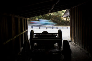
An outdated manual wagon, once used for transporting lumber, sits abandoned in the Old Woodside Store Museum. Once the pinnacle of its time, it is now shrouded in cobwebs and desolation. The head of the wagon, facing away from the camera, is cruelly pointed towards the bustling Woodside Road. Day in and day out, automobiles race in glee to every which location, unknowingly taunting this outdated artifact. Through rain, hail, and shine, it sits in defeat and awaits in loneliness for visitors to come. (1/5)
Framed
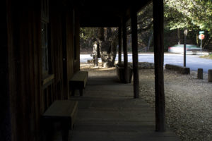
The hall of the Old Woodside Store juxtaposed to Tripp and Woodside Roads. The dark-to-light gradient, similar to the last photo, represents the passage of time. The obsolete architectural build of the Old Store is usurped by the innovative, smooth design of the nearby road and car. Though the hall if centered, the eye should be drawn to the bright, vibrant landscape near the right of the photo. Through all of the seasons, the two benches in the hall rarely get the warmth of attention by those who pass by. (2/5)
Gated
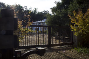
A stunning mansion lays hidden behind a conspicuous gate and shadow. The brightness and vibrance of both the mansion and surrounding vegetation lay inaccessible due to the gate. The keypad in the foreground taunts while the long shadow mimics an impassable cell. The brightness of the sky and the vibrance of the trees (more visible in full resolution) beg one to enjoy them. In this modern society, however, with everything gated off and all property private, these beauties cannot be enjoyed. (3/5)
Disguised
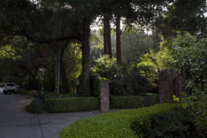
Three towering redwoods offer a majestic center to the photo. To the left, however, an unsightly telephone pole lays disguised. To the further left, a vehicle lays almost out of frame. Pillars of bricks and layers of cement dominate the photo, combining to subtract from what would otherwise be tranquil, towering beauty. Regardless of how much man attempts to disguise his impacts, they will always be visible if the eye is keen enough. And when they become visible, the serenity of nature is irreparably altered. (4/5)
Mirrored
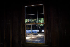
In the final shot, a lone window into the Old Store mirrors Woodside Road. Its surroundings are dark and ominous, a relic of a past time, while the reflection in the window is bright, vivid, and lively. This pane, which once offered a peer inside a bustling post office, now reflects its usurper. Moreover, it potentially foreshadows the future for the road: it may become obsolete itself, sometime in the near future. (5/5)
A Romantic Medium
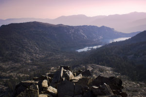
Following the backcountry/nature motif hinted at throughout this document, the most apt backdrop for this photo ought to be the stunning Tahoe backcountry. Peering off into miles of untouched scenery after undertaking the challenge of a summit is indescribably romantic. The relief, sense of achievement, and unparalleled beauty combine here for an unforgettable moment. This image was altered in photoshop as a red filter was passed through the haze, contrasting with the deep blue (visible in full resolution) of Echo Lakes. Rosy Red, being a stereotypically romantic color, is the primary source of romance through the image. The pristine lake and vegetation-dotted mountains contribute to render this the quintessential romantic medium. (1/3)
Fair Enough

After talking about negative effects of urbanization, detailing outdated relics, and working through mundane basics of the camera, I’d like to end on a humorous note. The last two images are considerably less serious- the last one especially- than the preceding images. In the above image, my father had fallen asleep on a rock after hiking seven or so miles. Despite the dramatic scenery, unforgettable views, and the refreshing lake, my father opted to nap, completely disregarding that we still had a half dozen miles left to trek. There was little to do besides say “fair enough” and continue taking photos. Considerable lightening of the corners and edges combined with intentional graining provide a dreamlike quality to the image (as always, better in full resolution). (2/3)
This is [an] Orange

This photograph is intended to be cryptic and humorous. The reasoning behind this photo is that I often feel that I’m forced to overanalyze things in education. For example, perhaps the author’s intent behind “the curtains were blue” was simply to provide a visual. The blue doesn’t necessarily need to represent depression or isolation. This photo is meant to be overanalyzed: the cryptic message to “be smarter” placed directly behind a pennant for the Villanova Preparatory School could be interpreted in a number of different ways. But the baseline: this photo means nothing. It is meaningless. The orange in the center is meaningless. The humorous remark is meaningless. The pennant is meaningless. It’s just a random assortment of objects thrown together. (3/3)